Brand refresh
Website design
Wireframing
UX/UI design
Art direction
Thatch
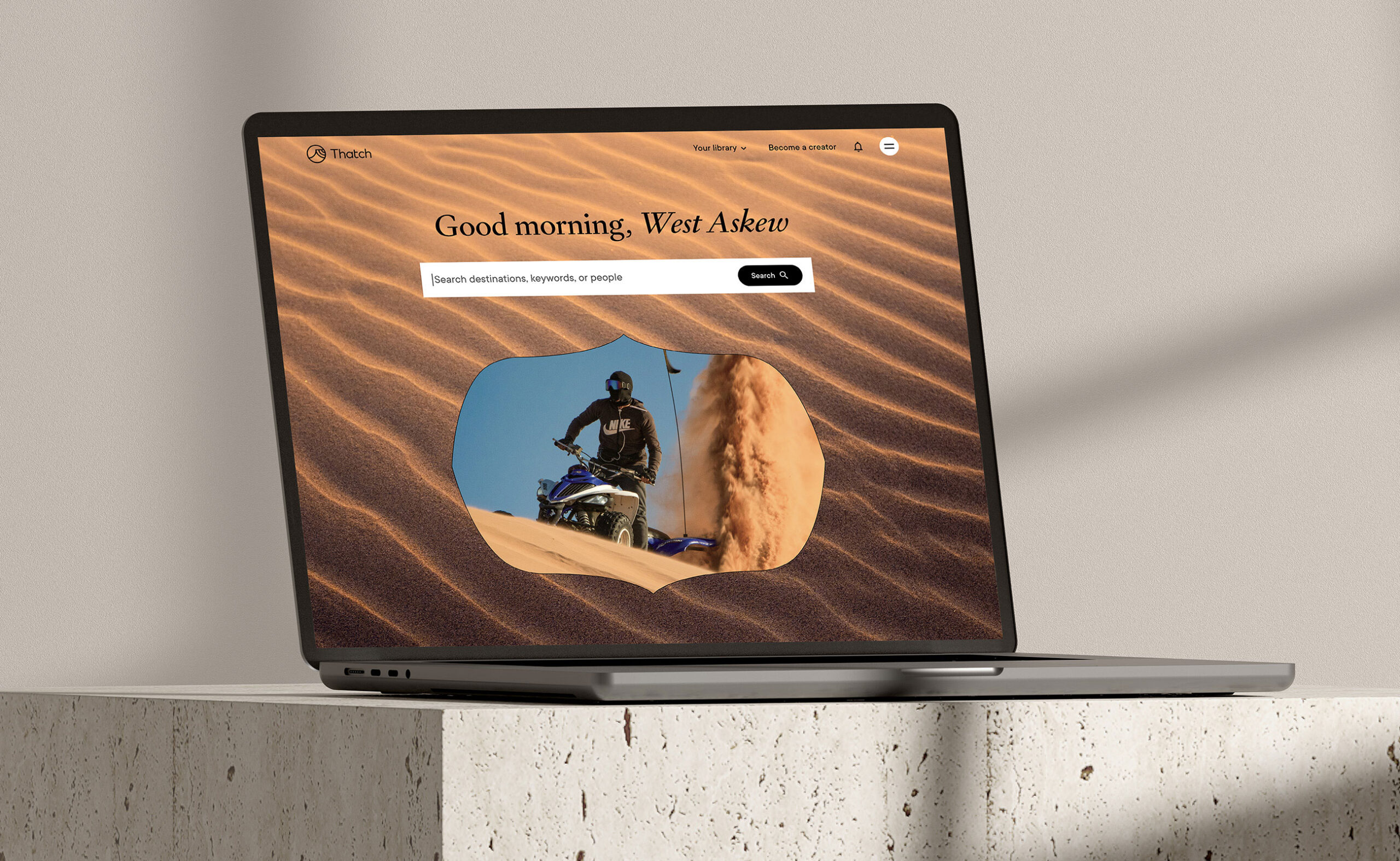
Thatch is a travel marketplace that makes it easy to discover and purchase unique travel guides and itineraries created by expert travel curators from across the globe. The company’s founders, West Askew and Abby West, engaged CōLab to revitalize their brand, enhance the product’s user interface and user experience, and bring the refreshed app experience to the web.
Previous company brand identity
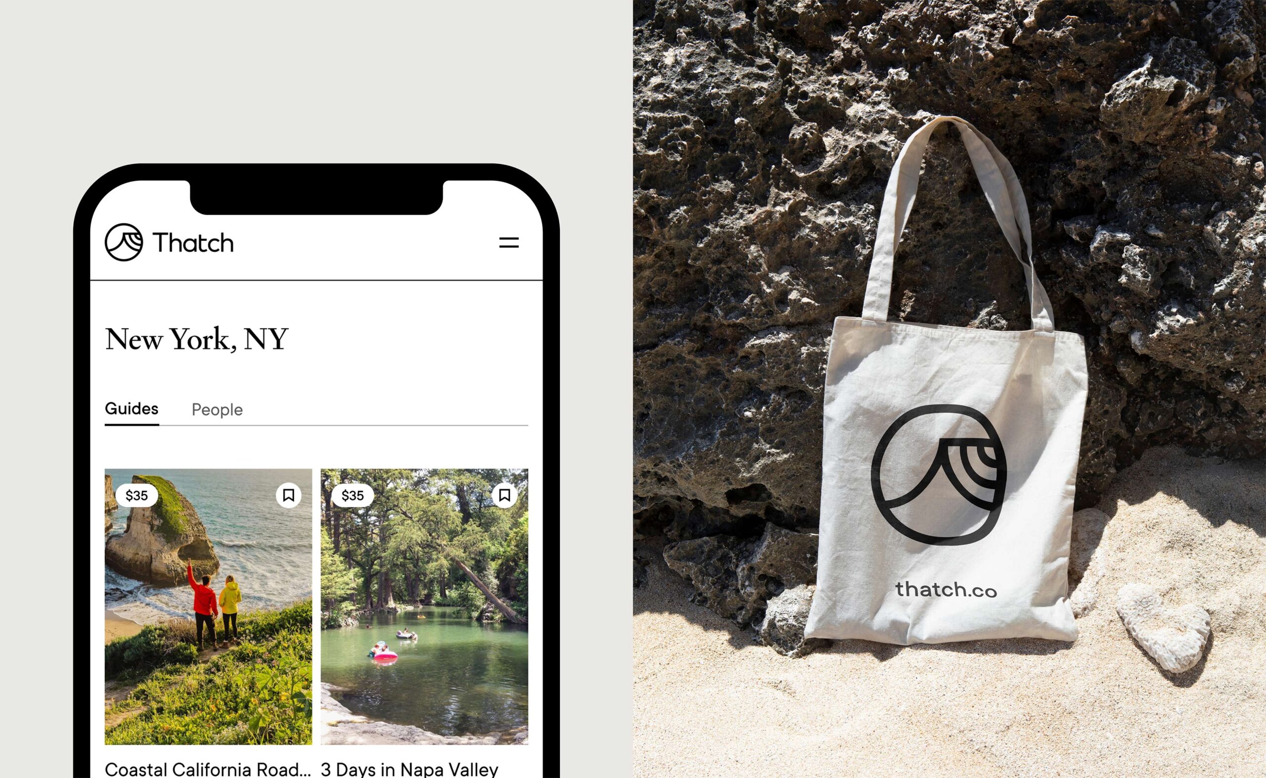
Initially, our focus was on refining the Thatch logo to achieve a clean, easy, and modern feel. We honed the edges of the logomark, fine-tuned certain curves, and altered the overall mark to be an outline instead of a fill. We coupled this with a sans-serif font of a similar weight to preserve an approachable aura while still appearing modern and clean.
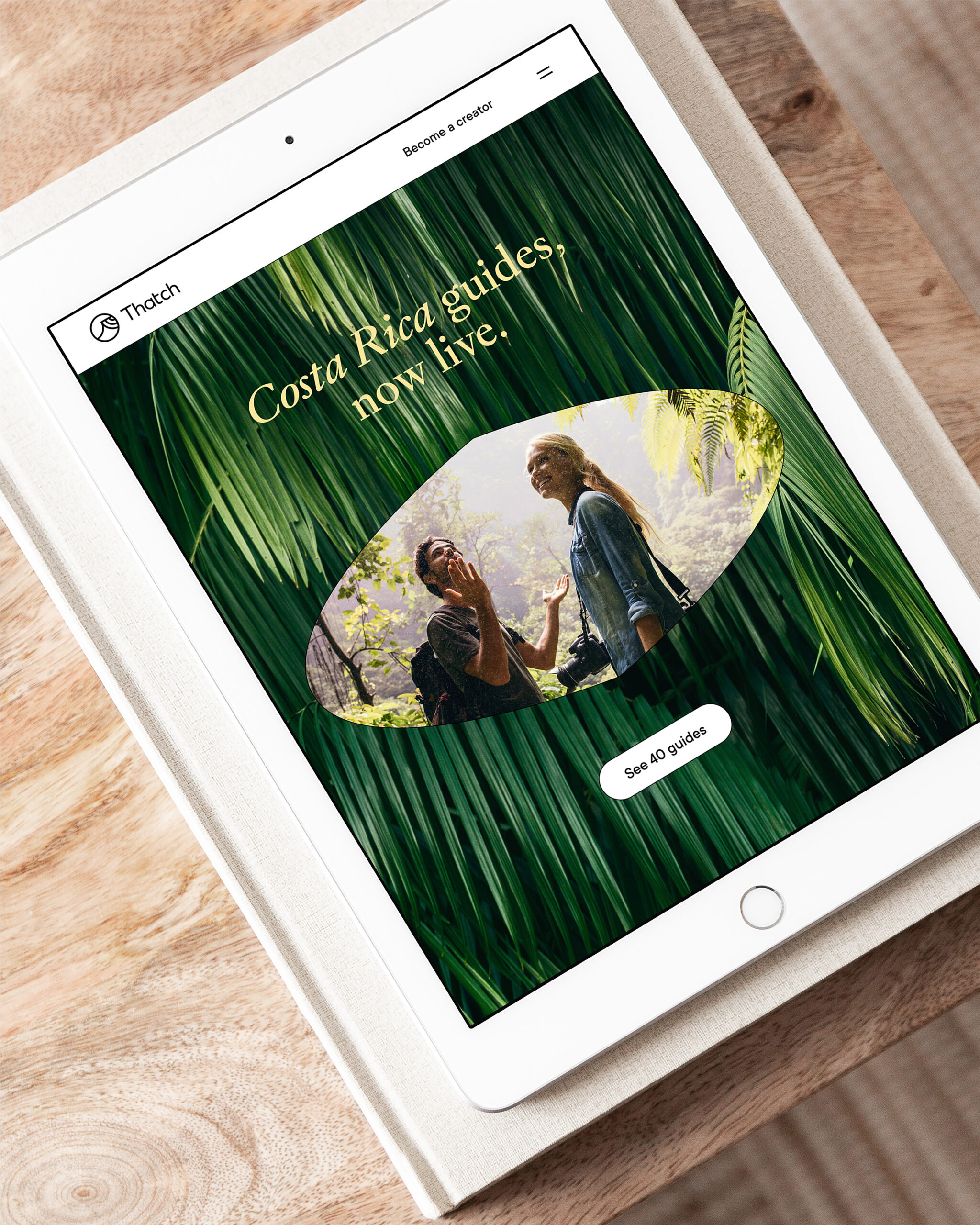
West and Abby desired the brand to also feel expressive and eclectic. To that end, we developed a rich color palette that embodies the essence of travel. Additionally, we experimented with typography, pairing TT Commons and Portnovo, with subtle touches of italics, to attain an editorial look and feel.
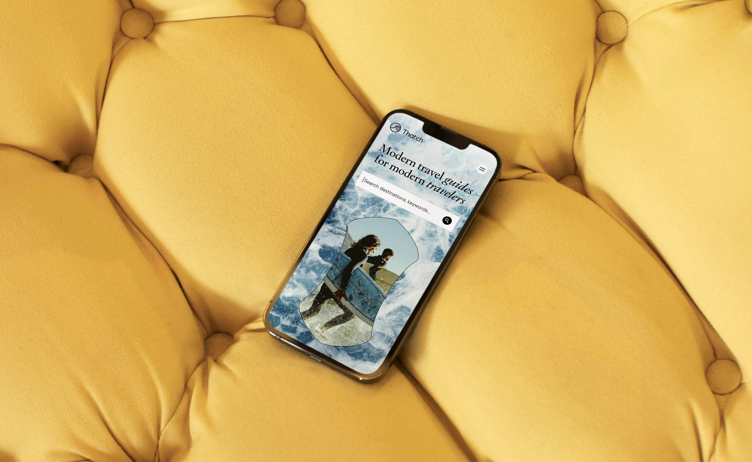
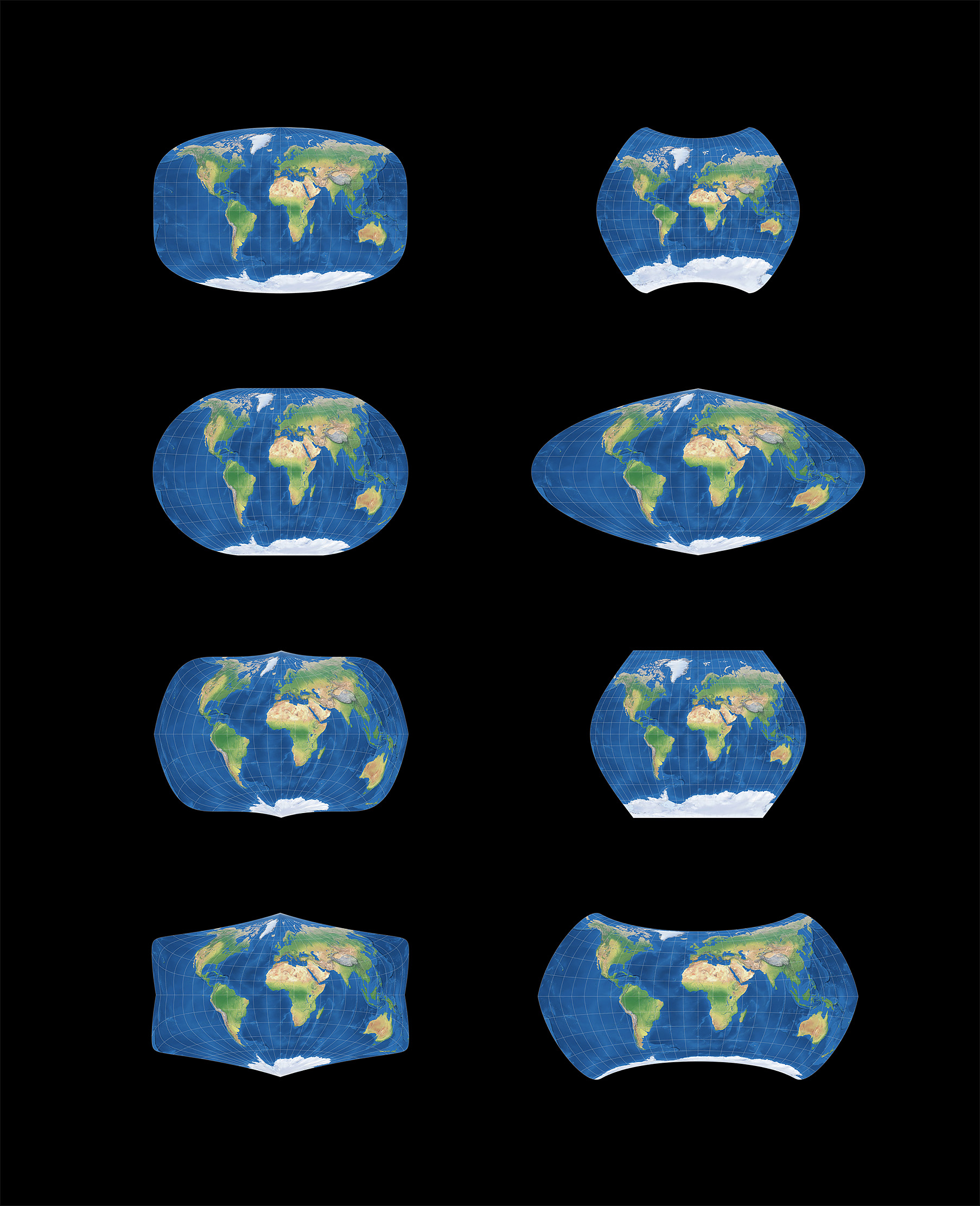
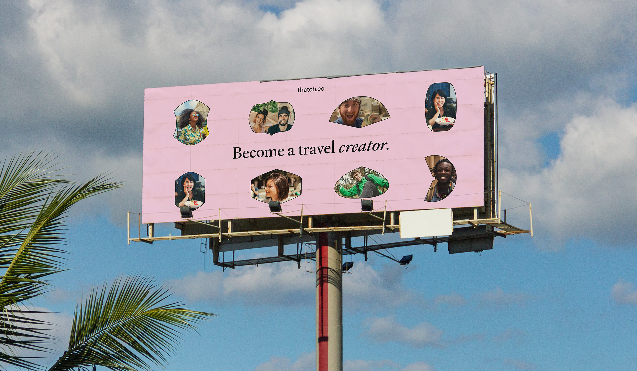
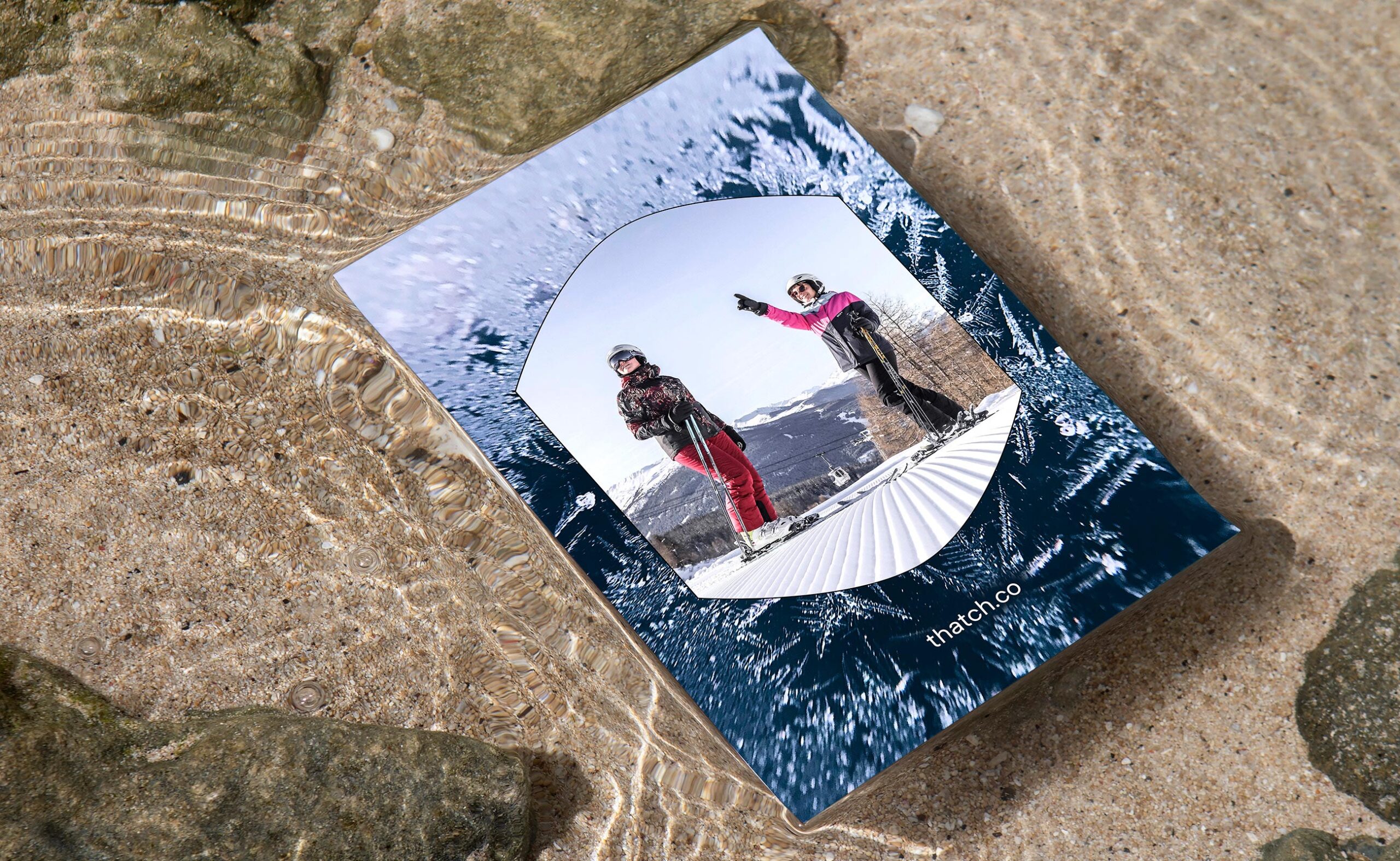
In our exploration, we were inspired by the concept of travel’s micro and macro perspectives. Through the use of first-person point-of-view photography, layered with close-up textures of various materials one might encounter during travel, we aimed to evoke a visceral sense of place and experience. Furthermore, we drew inspiration from map projections and incorporated it into the brand system by utilizing various map shapes as containers. This component was applied to cropped photography, lending a more intriguing perspective and ensuring consistency throughout the brand.
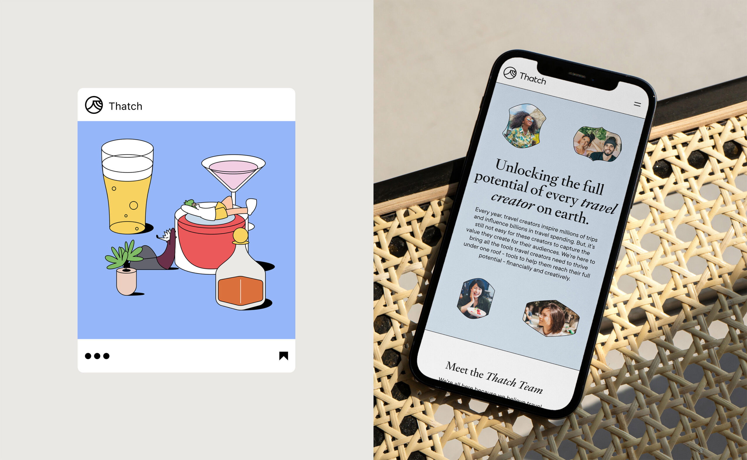
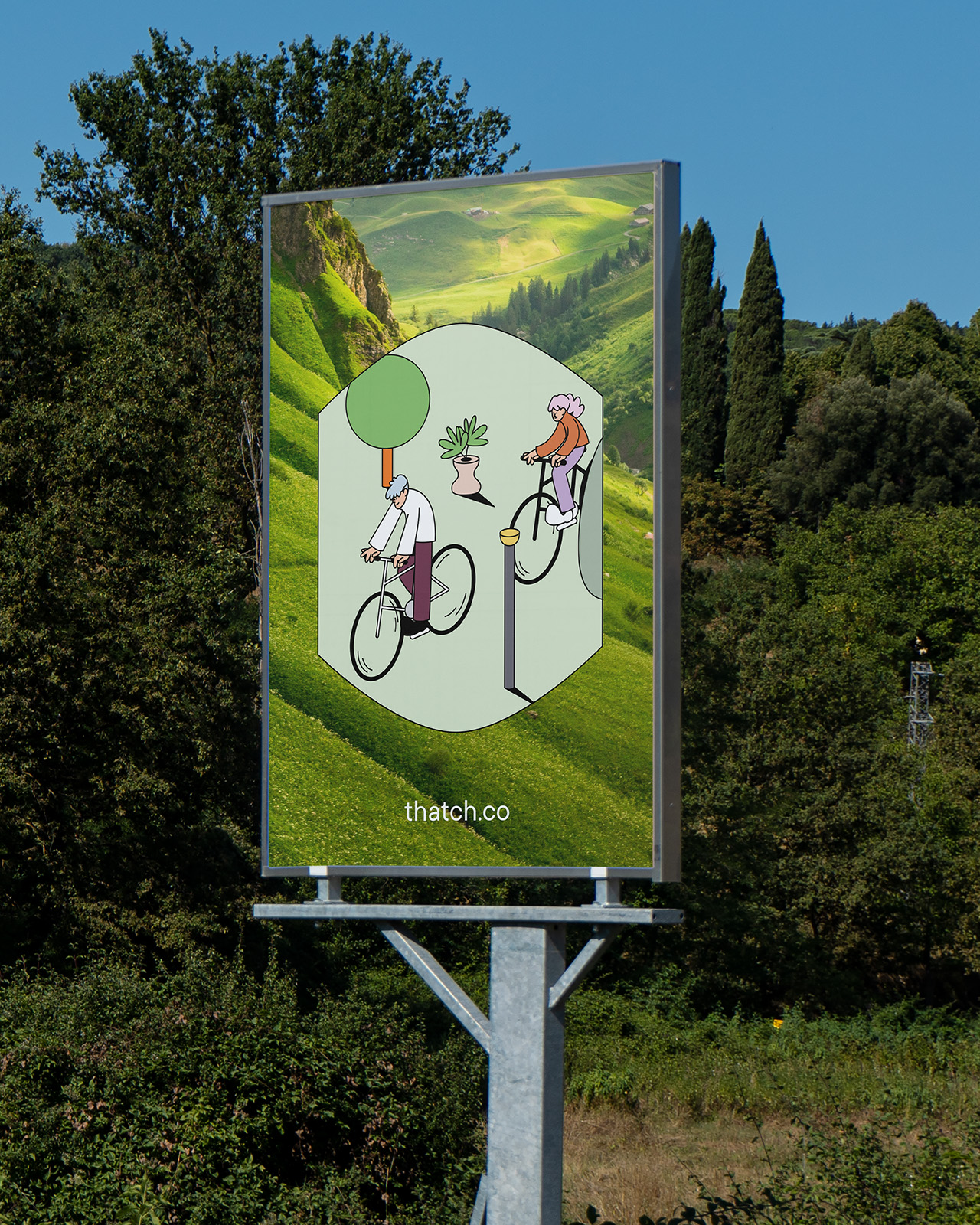
For illustration, we recommended Thatch collaborate with Thanawat Sakdavisarak, a Bangkok-based illustrator. We deemed his style of geometric fine-line illustrations to be a harmonious complement to the refreshed Thatch brand’s clean, eclectic, and approachable personality.
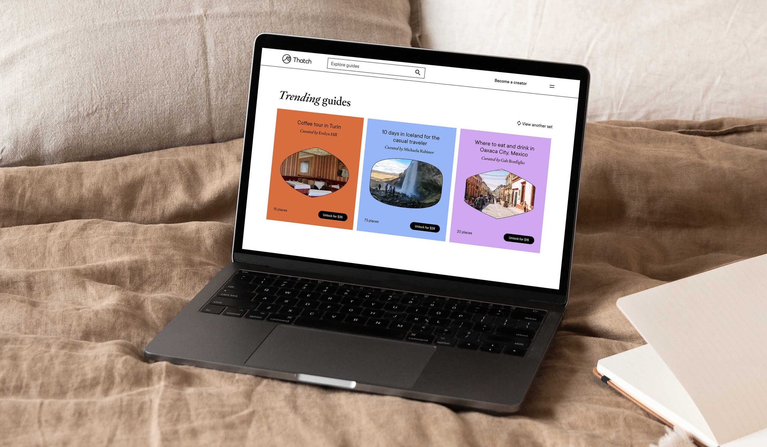
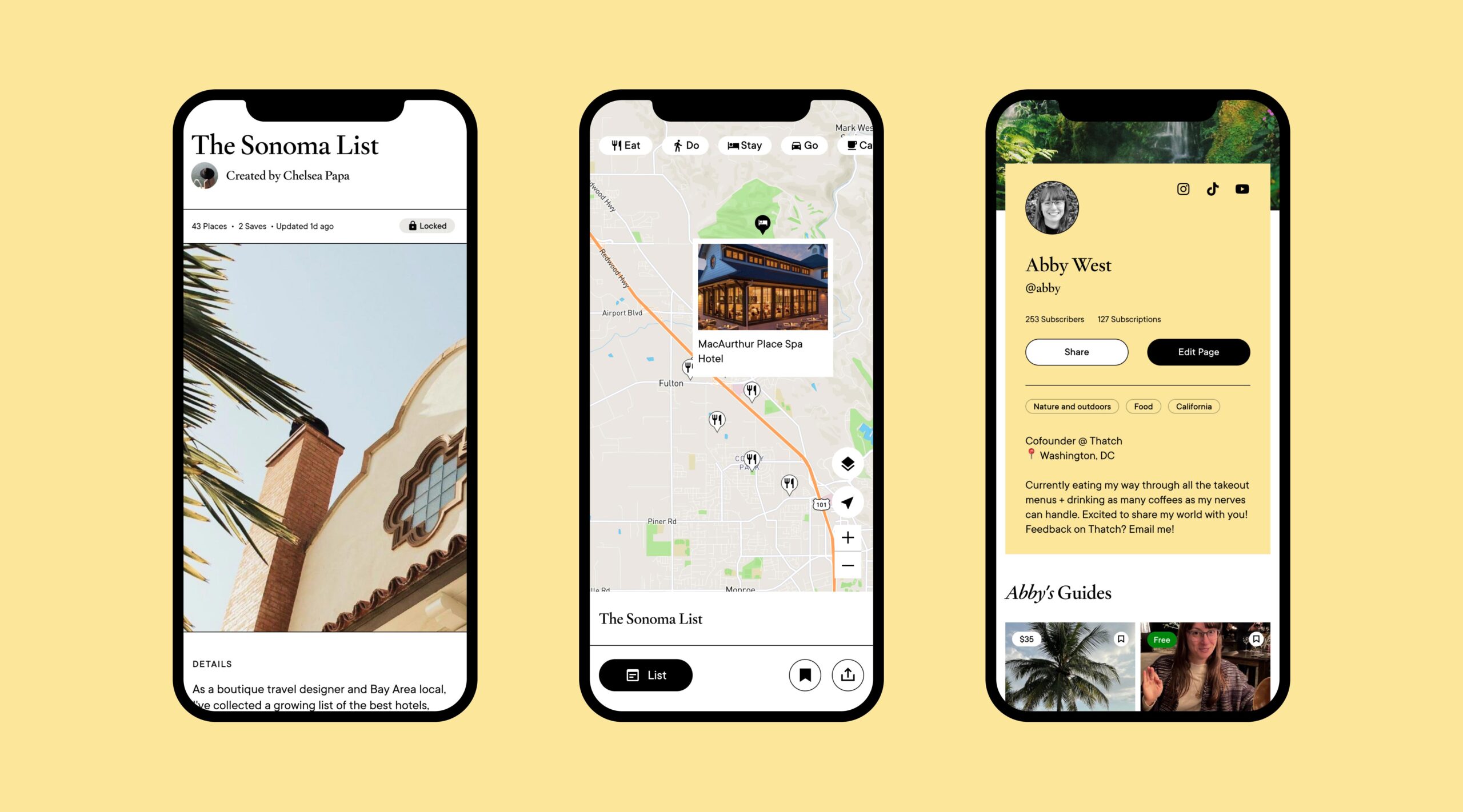
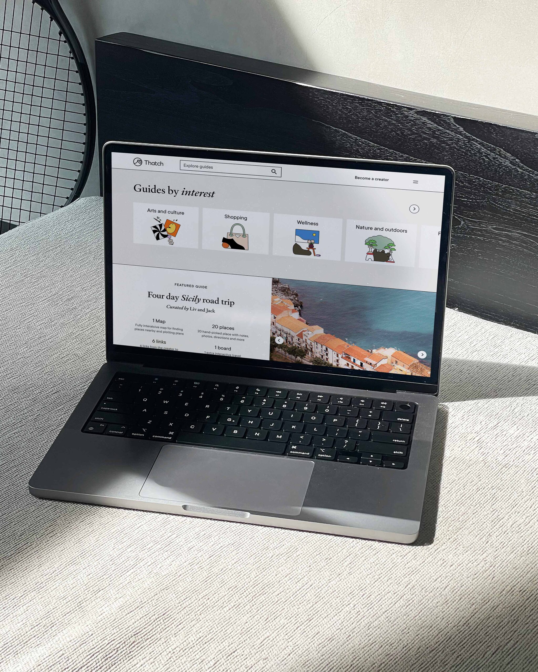
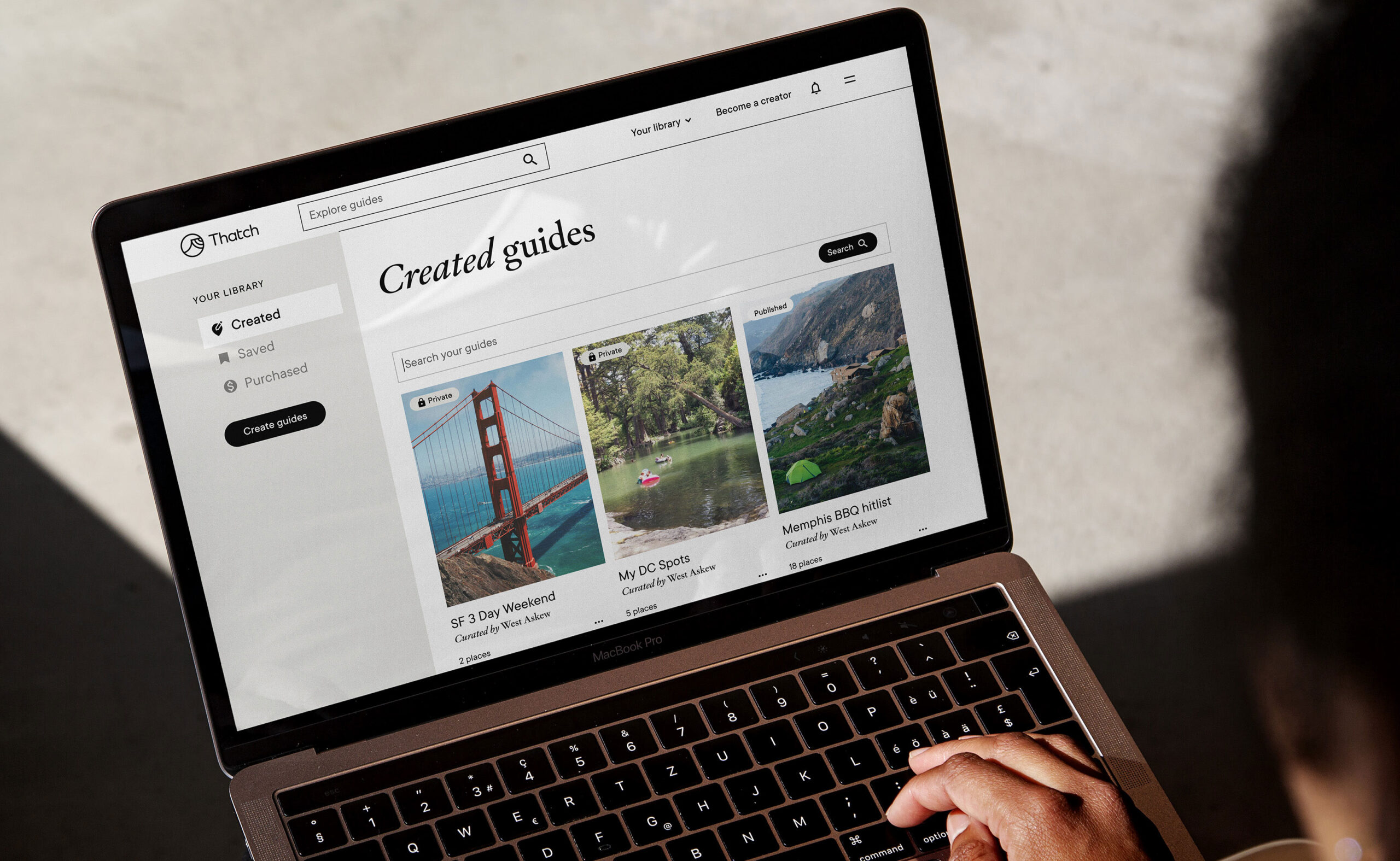
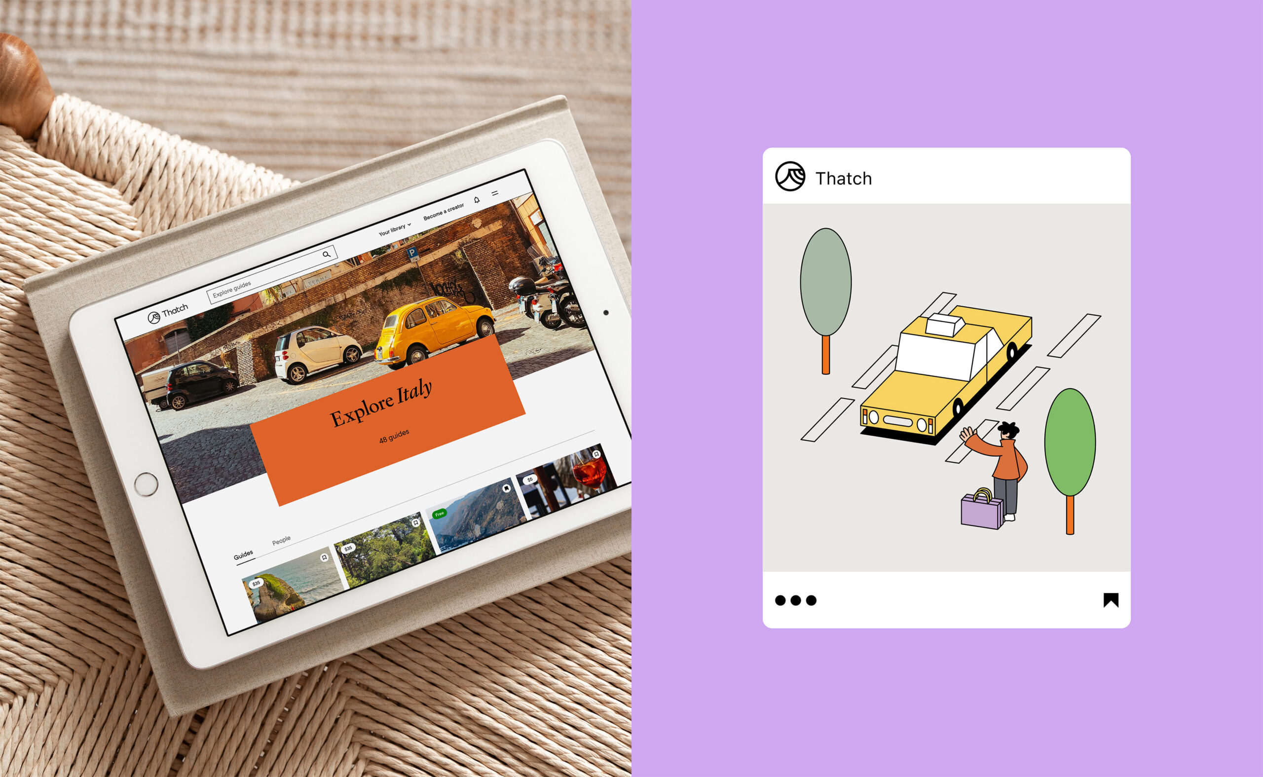
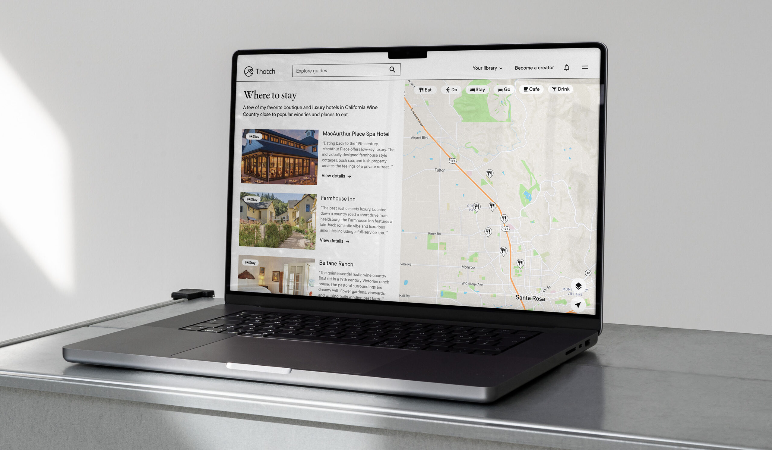
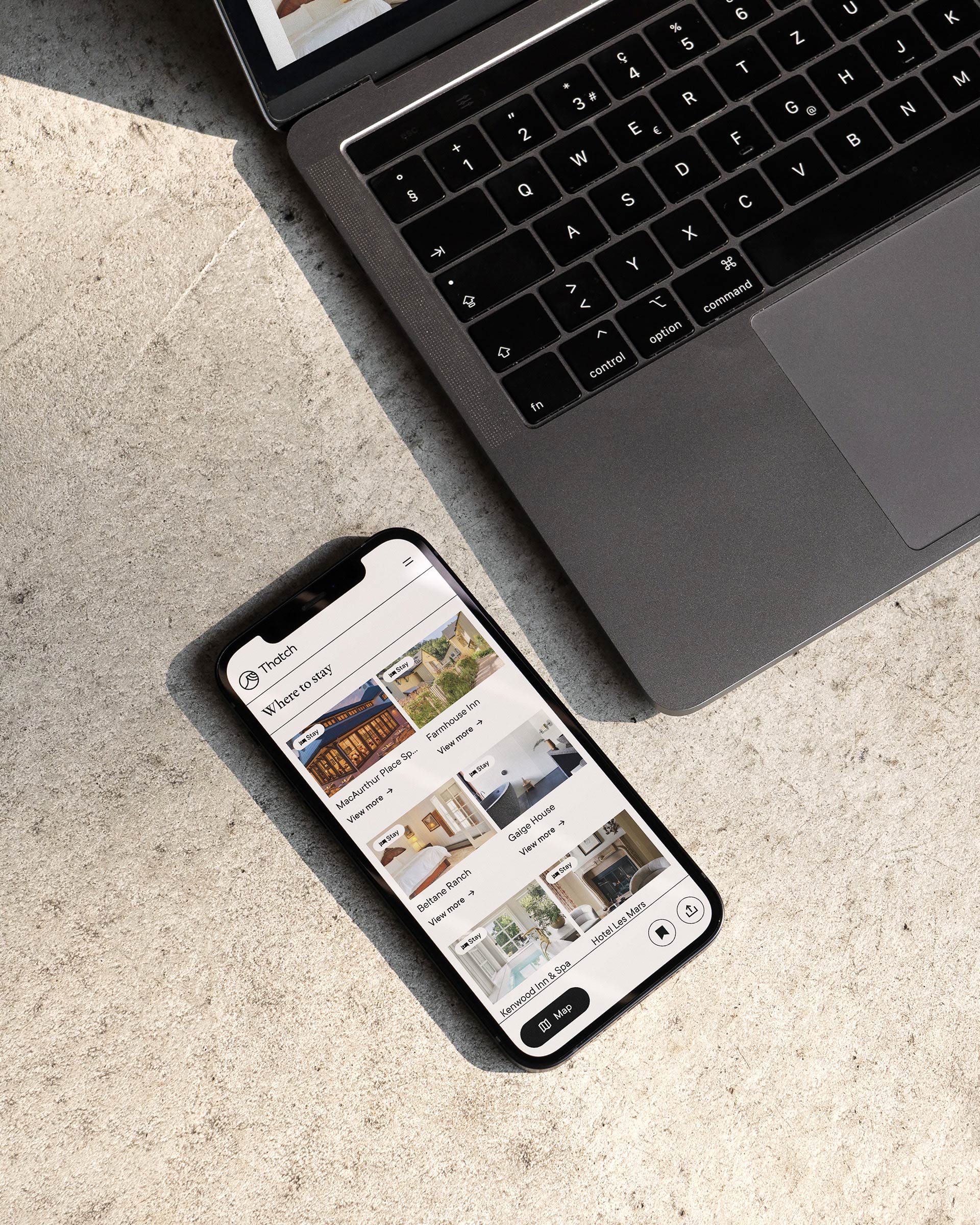
Having revitalized the brand system, we then turned our attention to the product experience, ensuring seamless integration with the updated visual system. In close collaboration with the Thatch team, we improved the app’s UI/UX and constructed a more comprehensive UI component library for both logged-in and logged-out states. We refreshed the core screen flows for both travel creators and travelers and designed over 180 responsive web screens/states.
The collaboration with the Thatch team was a great success, as they were highly engaged and open to our recommendations. Our shared vision and commitment to excellence resulted in a refreshed brand and an enhanced product experience that embodies the company’s mission and ethos. The updated visual system, logo, color palette, typography, illustration, and UI/UX design seamlessly blend to create a consistent and memorable brand experience for Thatch’s customers.
“Working with CōLab was a game-changer for Thatch. Our old website and brand was outdated and didn't accurately reflect the growth and evolution of our community and platform. CōLab listened to our needs and goals and brought our vision to life with a stunning brand refresh and a completely redesigned web experience. The process was seamless and the end result exceeded our expectations. We highly recommend CōLab to anyone looking to elevate their brand and take their web presence to the next level.”
West Askew, Co-founder at Thatch
Collaboration at its finest
Special thanks to the Thatch team:
Abby West: Co-founder
West Askew: CEO & Co-founder
Illustrations by:
Thanawat Sakdavisarak
CōLab team:
Yu Rong, Jason Mamaril, Kyle Macy, Salih Abdul-Karim, Gretchen Klotz
