Branding
Positioning
Naming
Visual identity
Art direction (Illustration)
Brand guidelines
Mooch
Superpowered budgets.
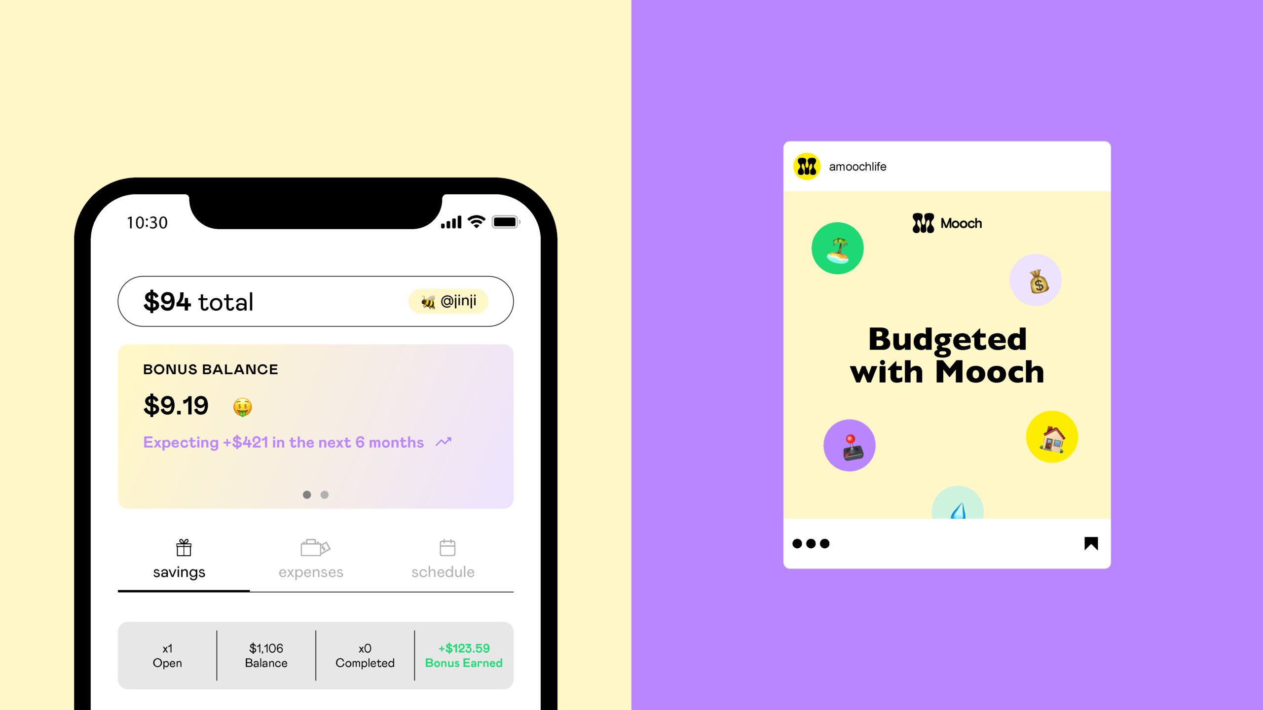
Kanbee was stuck. They had won substantial seed round funding for their unique personal budgeting app, but their name trademark was being challenged a few short months before launch. Working with Cōlab, they quickly pivoted. First by solidifying their brand purpose and story, then developing a memorable new name, Mooch, that alluded to how the service worked (it “mooches” your money to help you save).
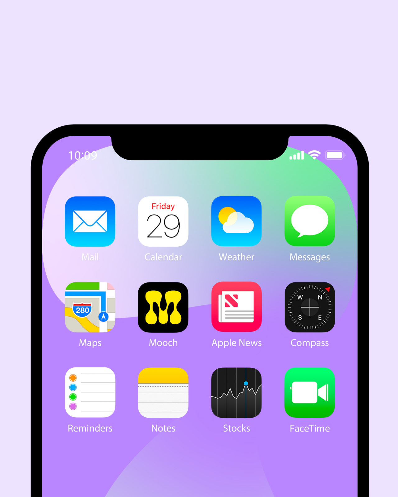

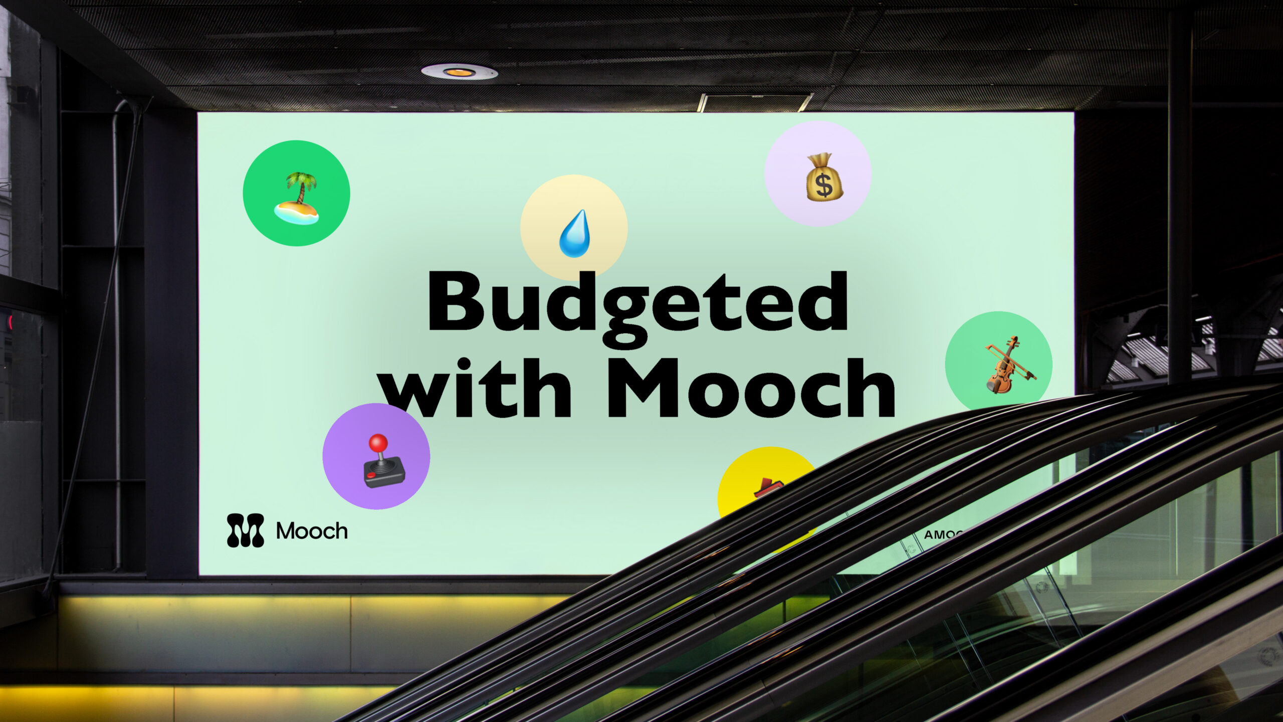
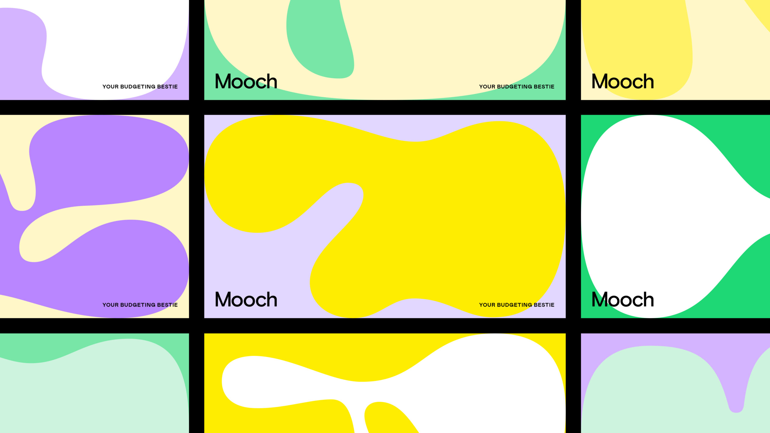
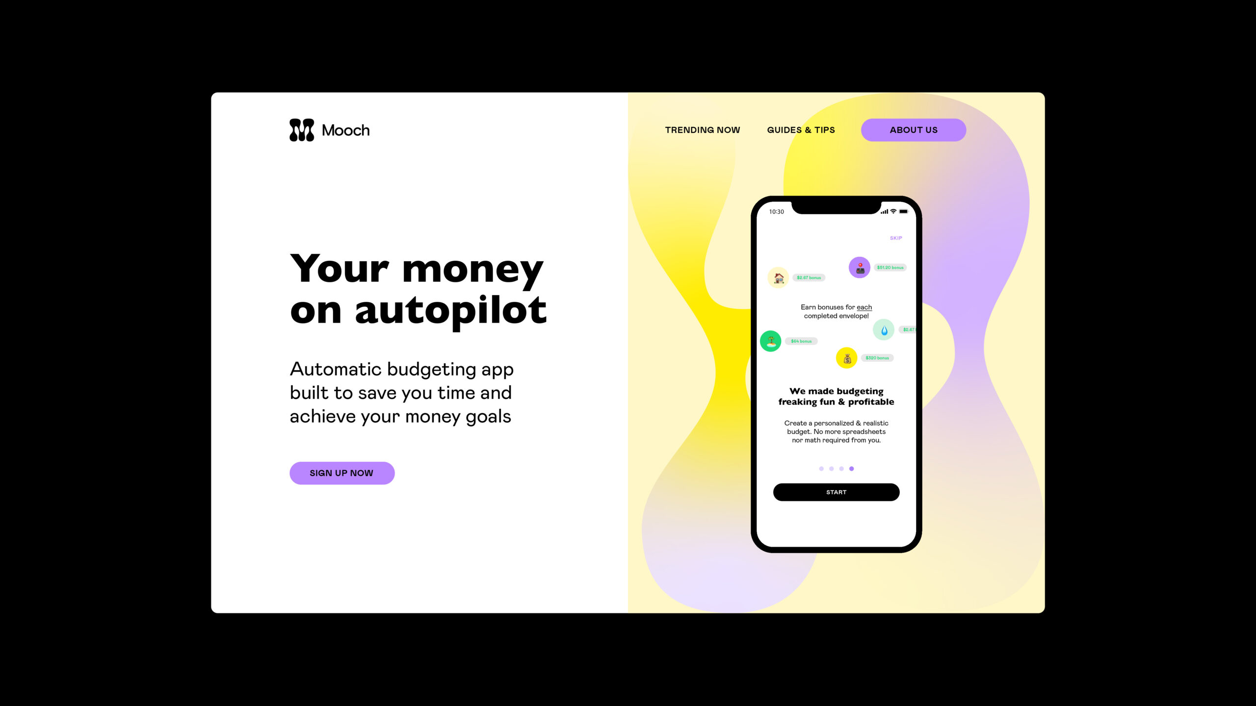
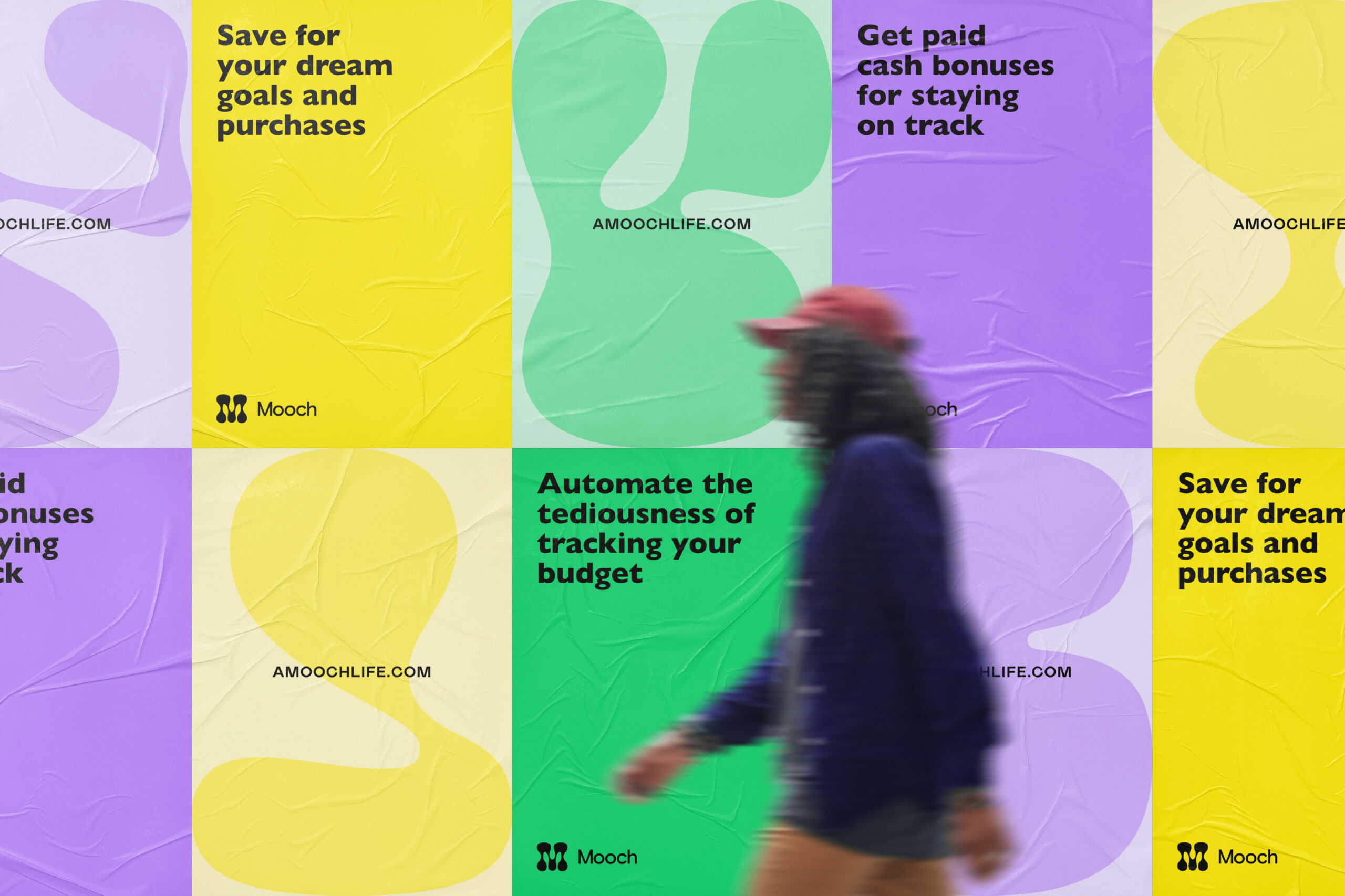
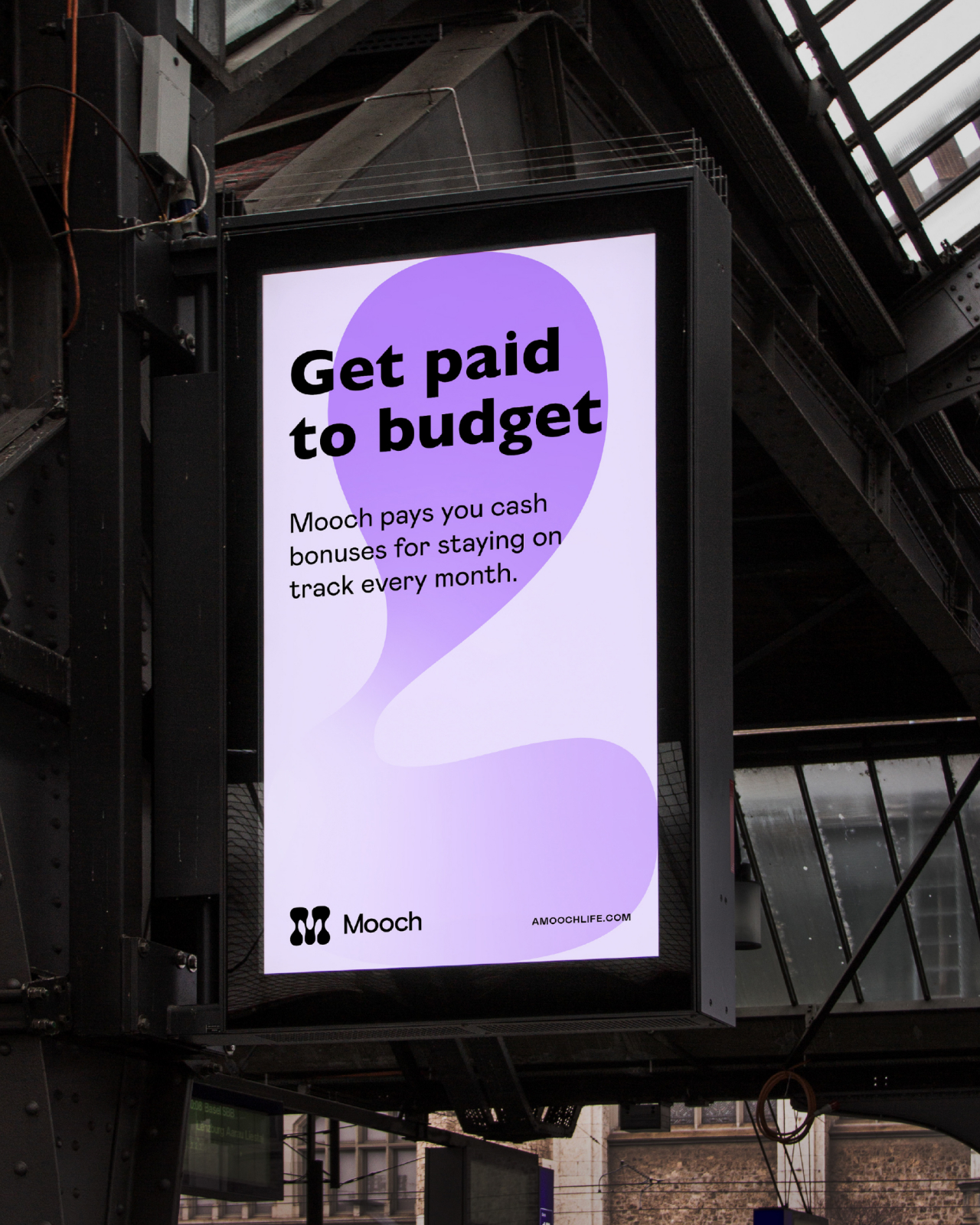
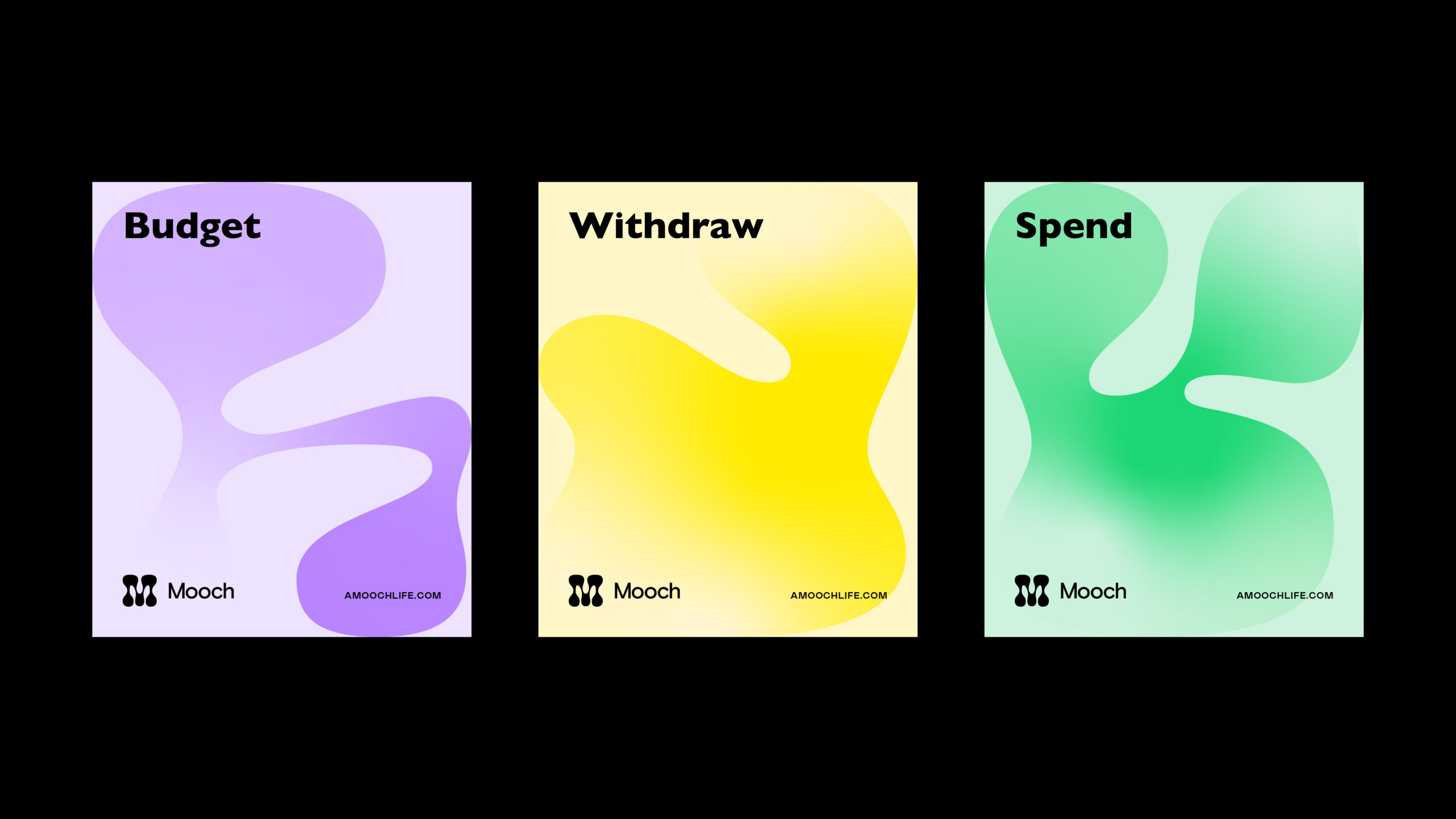
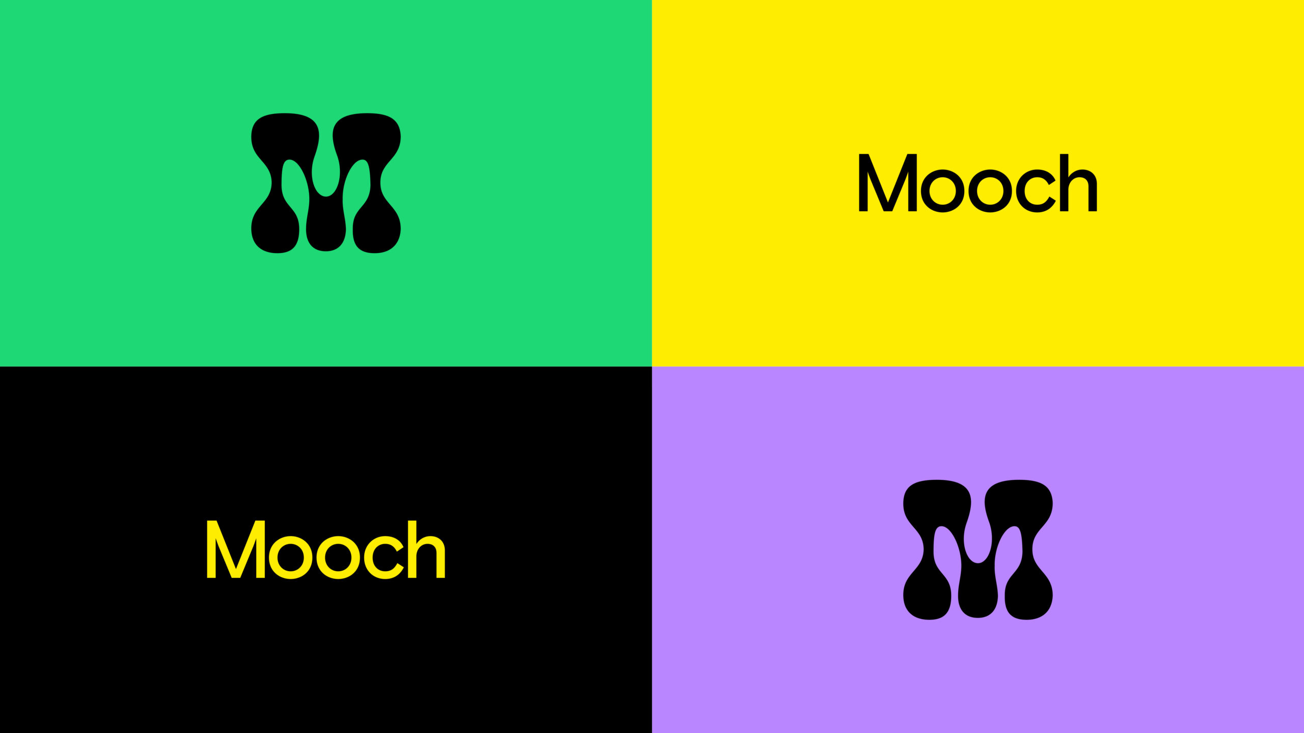
Appealing to the sensibilities of their Gen-Z target audience, Cōlab developed a striking new brand identity that stood in stark contrast to other finance and budgeting apps. Through a playful logo and energizing, bold colors, Mooch invites customers to put your bills on autopilot. Our lava lamp inspired graphics give the system a feeling of constant motion, helping consumers visualize the cyclical ebb and flow of budgeting, saving, and eventually withdrawing.

Collaboration at its finest
Special thanks to the Mooch team:
Richard Velasquez and Kevin Jiang: Cofounders
Rina Takikawa: Lead Product Designer
Bryn Edwards: Marketing Lead
CōLab team: Brian Wakabayashi, Kyle Macy, Gretchen Klotz, Mishaal Abbasi, Salih Abdul-Karim, Jason Mamaril
